
midori
a user experience checkout workflow project

role: UX researcher, UI designer
timeline: 1 week
project purpose: Human-centered interaction design course
software: Adobe Xd, Adobe Illustrator
objective
To analyze the typical mobile checkout process and develop a user friendly design for your own company. I wanted to create a hypothetical plant shop that would allow customers to easily get their favorite plants delivered to their homes. The name I decided on was “midori”, meaning green in Japanese. I focused on a more minimal approach, with a green as an accent color. My hope was to create a design that was simple and calming.
research
I analyzed the LUSH cosmetics mobile checkout flow for both first time and returning users to figure out what steps in the flow could be changed. As shown below, the returning user checkout experience is significantly shorter than an individual using the application for the first time. I found the navigation on the application to be long and a bit difficult to use. Two issues in particular that I had dealt with browsing for products and saving information during the checkout.
Items circled in red are things I wanted to change or had trouble with
user flow: first time user
first time user, part 1
first time user, part 2
user flow: returning user
wireframes

lo-fi wireframe

overall wireframe

adding to cart

checkout
logo design

logo iterations

finalized logo
final screens
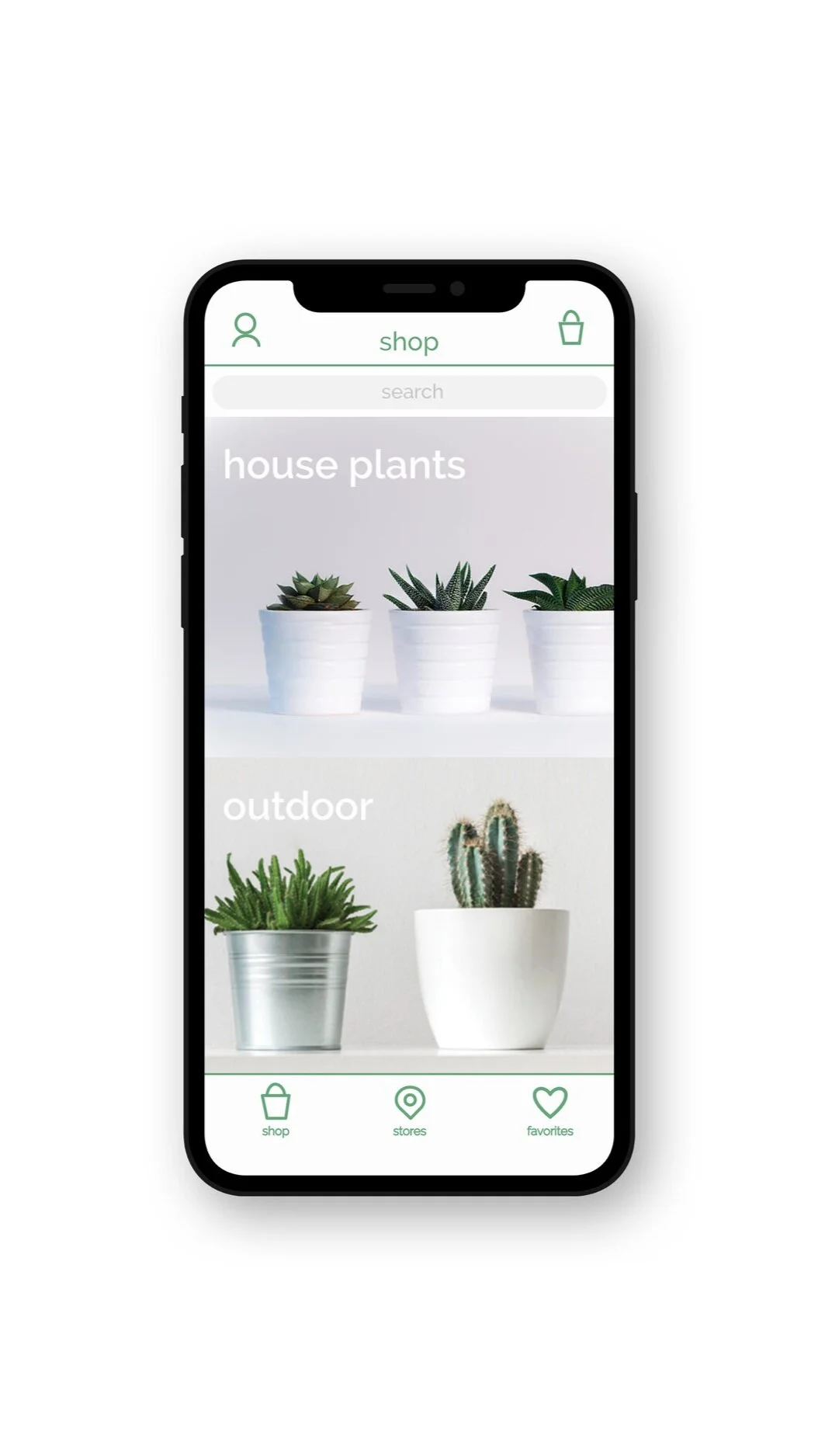
home screen

house plant selection
high fidelity mockup

checkout screen

complete checkout screen
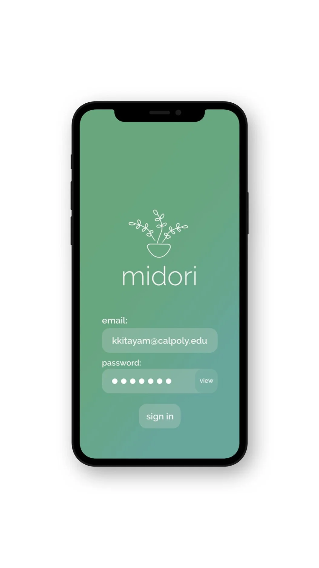
returning user login screen

guest checkout screen
takeaways
Creating Midori allowed me to gain a better understanding of user experience design and designing with the target consumer in mind. Upon creating my prototype, I held five unmoderated remote tests which revealed that Midori’s checkout flow was “easy to use” and “user-friendly” for its users to operate. Users enjoyed the color palette and user interface for Midori’s application. While everything felt straightforward to me, my user testing showed me a few design flaws that I did not even consider initially. If I had more time on this project I would redesign the checkout page, “save information” page, and login screen for a returning user.