
locate
An augmented reality navigation application for mobile phone and lens
role: UX Researcher, UI Designer
timeline: September – November 2020
teammate: Trucdan Nguyen
project purpose: Interaction design course
software: Adobe XD, Adobe Photoshop
objective
Locate provides its user with the ability to view their directions using augmented reality (AR) through a smart lens. After inputting a destination on the mobile phone application, users can choose to view their directions through AR arrows and directions until safely arriving at their destination. If a user feels unsafe at any given time, there is an emergency dispatch number they can press in the app for immediate assistance. Safety is the number one priority of Locate, and by making these easily accessible for users, it eliminates additional steps that could potentially put users in danger.
competitor analysis

Circle of 6

Google maps AR

AR City

Yahoo Maps (Japan)

Apple Maps
Yahoo Japan Maps: updated their iOS maps by incorporating an AR mode. While walking to their destination (which is denoted with blue and white arrows) the user also leaves footprints behind to indicate their distance traveled while being accompanied by Kensaku puppy.
Google Maps AR: does not include features that solve issues of accessibility and safety
Circle of 6: app targeted at women, allowing for them to select six trusted individuals to inform on your safety and wellbeing through preset messages. Includes a distress icon that, when clicked sends a distress message and GPS coordinates to your trusted circle.
target audience
Uses Locate to view their surroundings & directions at the same time to get home safely
Are avid mobile phone users with a piqued interest in the development and integration of AR
user persona

interaction design
interaction framework

scenario

user testing
usability analysis test
Notify your #1 emergency contact, Aunt Sally and send your default message that you have arrived home safely. Return to home navigation when done.
Search directions to the nearest bus stop and view the route overview for quickest suggested route on your phone
Go back to suggested routes for 4A bus stop and go with smart lens instead of viewing on mobile phone
usability test results
From testing, the following suggestions were made:
If you’ve “arrived” at your destination, remove the additional Safety features like the calling 911 and send location buttons
Reduce the number of “cancel” buttons on the interface design, having three different options is too complex
Arrival screens are too lengthy and include too many options
Remove the back arrow after the arrival end navigation screen and combine features from that and the Safety option screen
changes from usability test


final wireframes

Destination search

Arrival screens
high-fidelity solutions
solution 1

Solution minimizes the use of color by primarily sticking to black and white for information and icons on the interface.
Brighter seafoam green is used to highlight the recommended route for the user up until arriving at their destination
Arrows and text remain big so users immediately know their next step.
Directions are overlaid on white rounded rectangles to provide contrast against the colored background.
solution 2


Colors minimal and implement only green as the primary color to signify an action button
Pulldown menu on the right-hand side will allow for users to view upcoming directions
solution 3


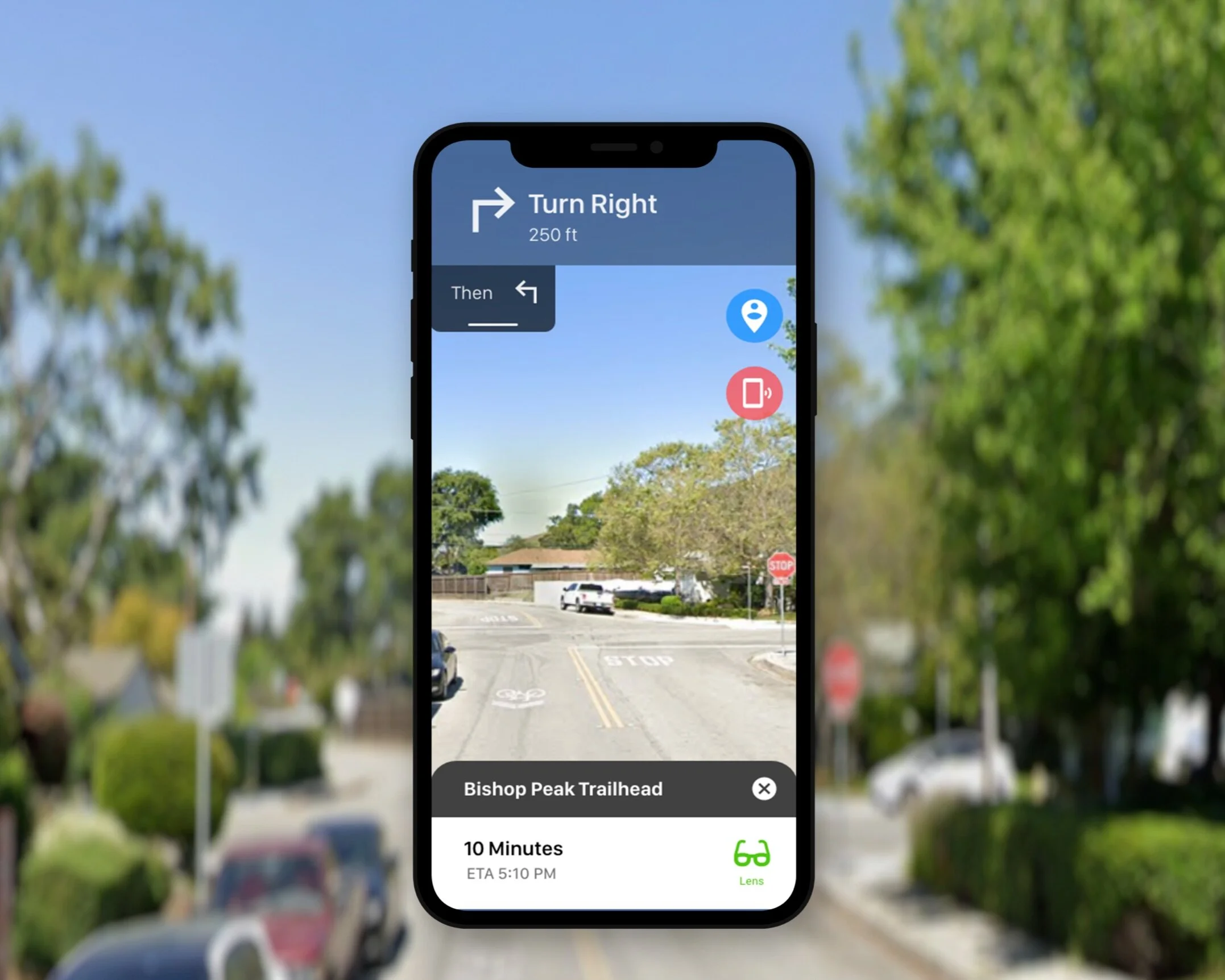
Main features categorized with primary color use
Intuitive for users to associate blue with safety, red for urgency (to call for help), and yellow for scanning
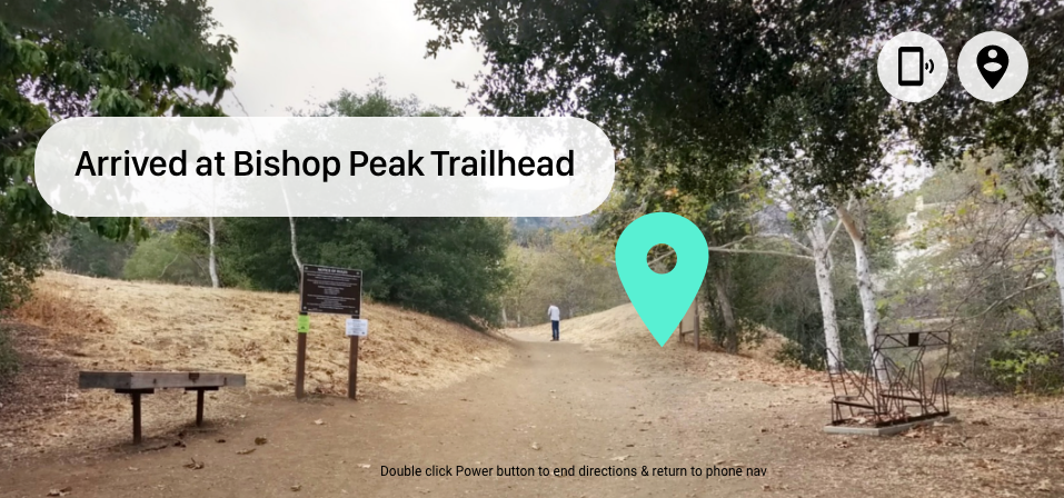
The “arrived” user interface is altered slightly from the last version to emphasize the accomplishment for a user to reach their destination.
final screens

Zoom feature (street sign)

Phone screen at start

Zoom feature

Arrival (lens)
takeaways
Working on the Locate project further allowed me to explore my interest in UX/UI design as well as researching for design. From this experience I further learned and was able to understand the importance of designing with purpose. If I had more time on this project, I would have conducting more user testing and done more research regarding inclusive design.